STRUCTURE of your site
It simply depends on your brand and the audience you want to reach.
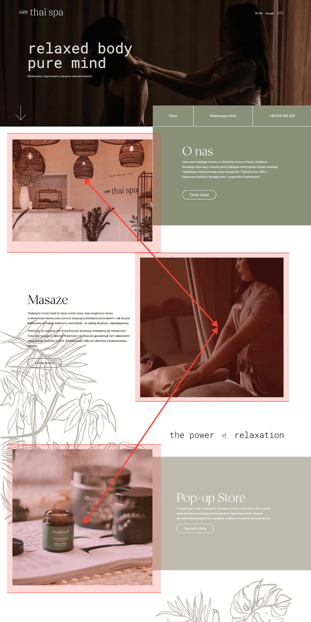
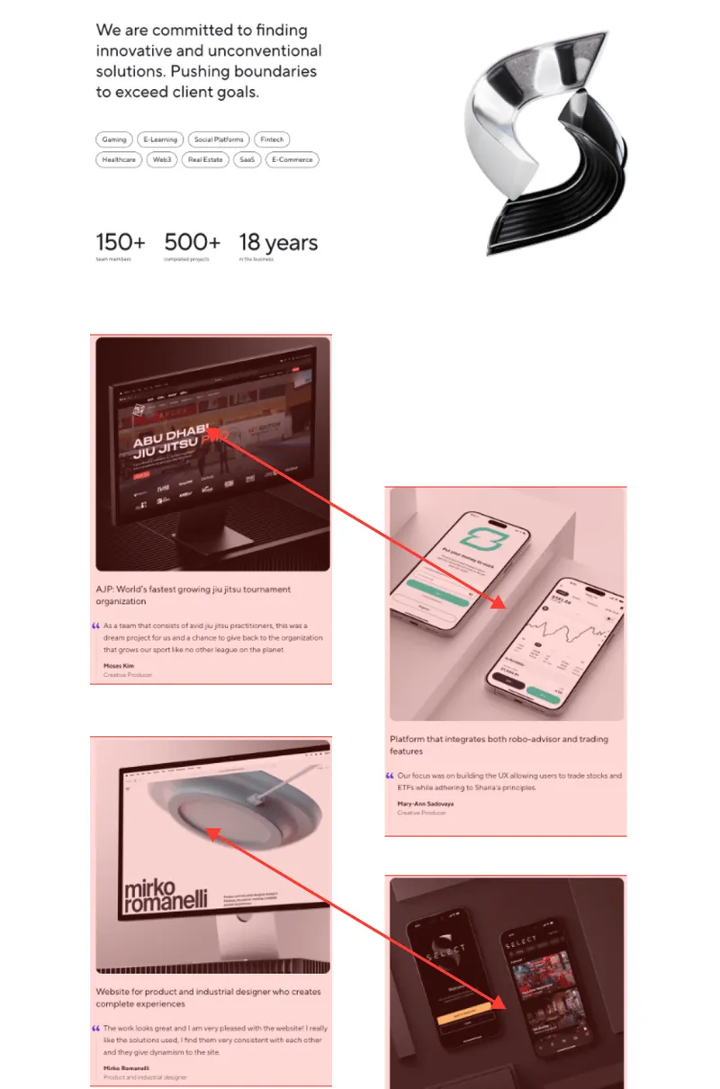
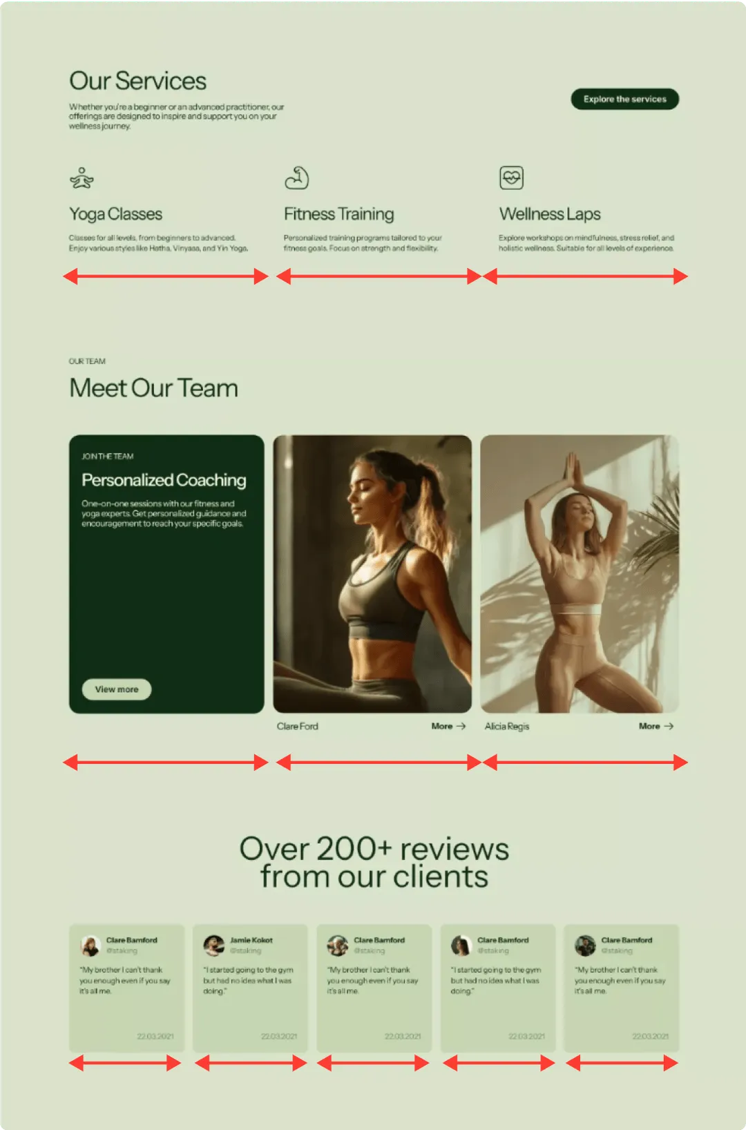
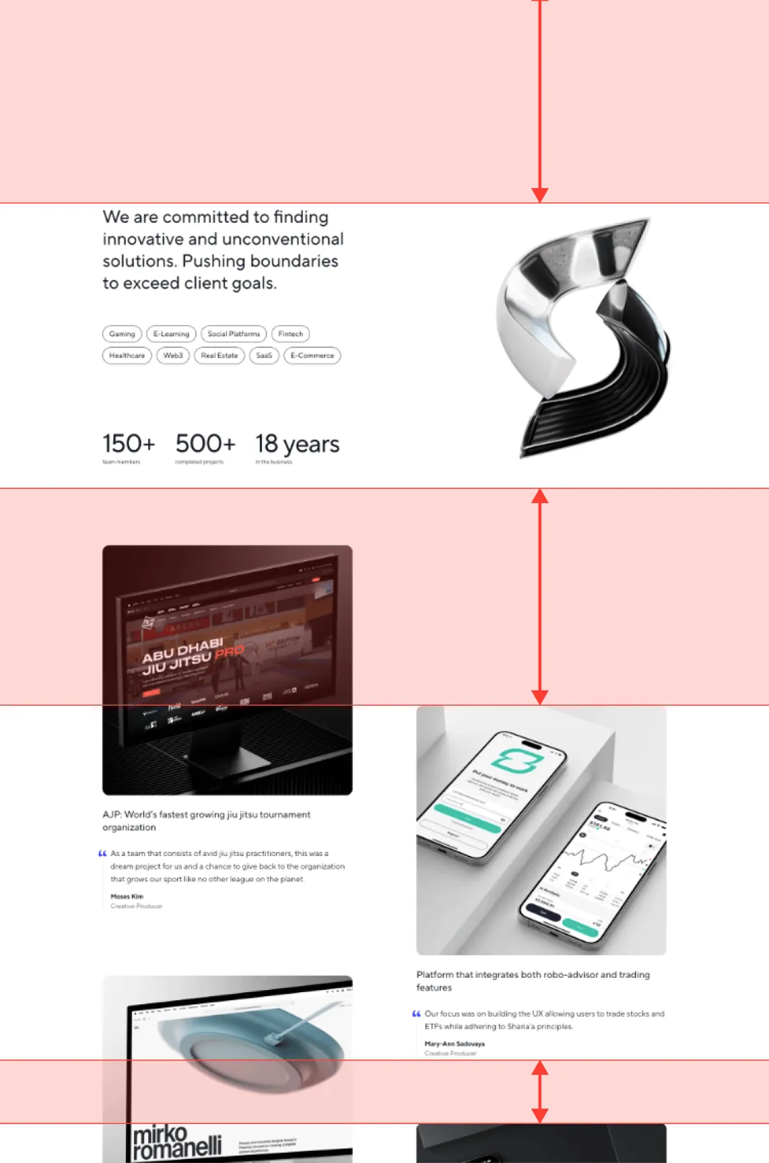
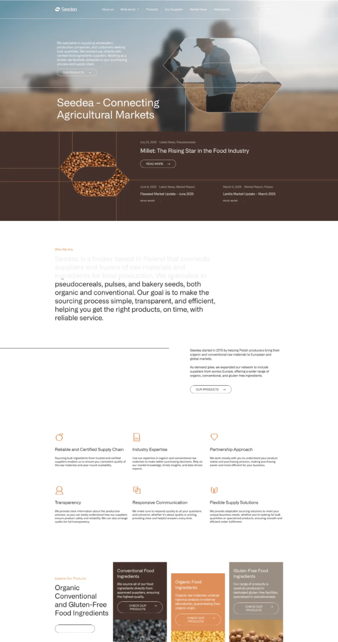
ASYMMETRICAL
A free-flowing layout with an uneven distribution of elements.It creates movement, dynamism and a sense of modernity. Light, engaging and visually unexpected.
Bold, creative and informal brands. Perfect for agencies, startups, lifestyle brands and younger audiences.
Energy. Originality. Freshness.
Lightness. Freedom. Creativity.
see how it works in practice
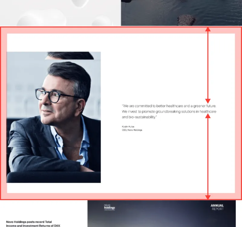
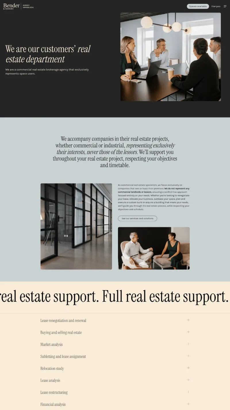
SYMMETRIC
A balanced layout based on mirrored structure. It brings order, clarity and a sense of stability. Clean, structured and highly professional.
Brands focused on trust, precision and reliability. Ideal for law firms, finance, institutions and premium brands.
Order. Elegance. Stability.
Predictability. Trust. Professionalism.
SEE REAL EXAMPLES online
COMPARE COMPOSITIONS
ASYMMETRICAL
SYMMETRIC
WHITE SPACE in LAYOUT
how much space elements have and how freely the layout can “breathe”.
White space (also known as negative space) is not wasted space - it’s what creates clarity, hierarchy and balance.
Used well, it can make a website feel either compact and information-rich or calm, refined and elegant.
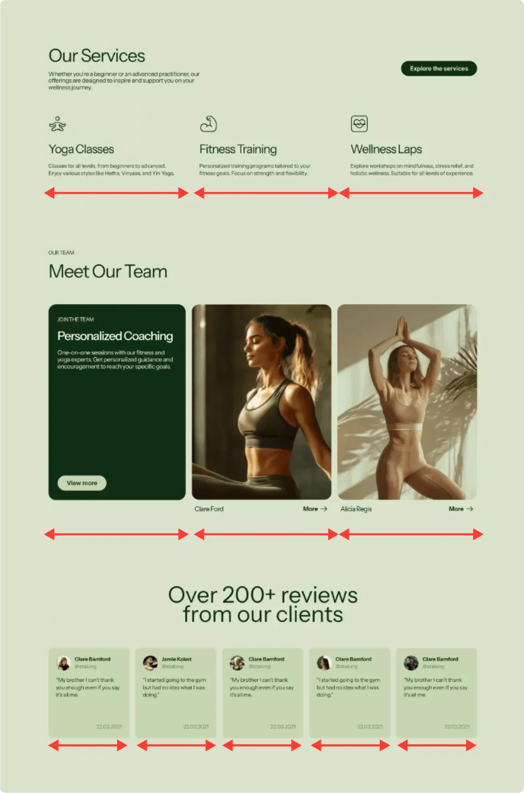
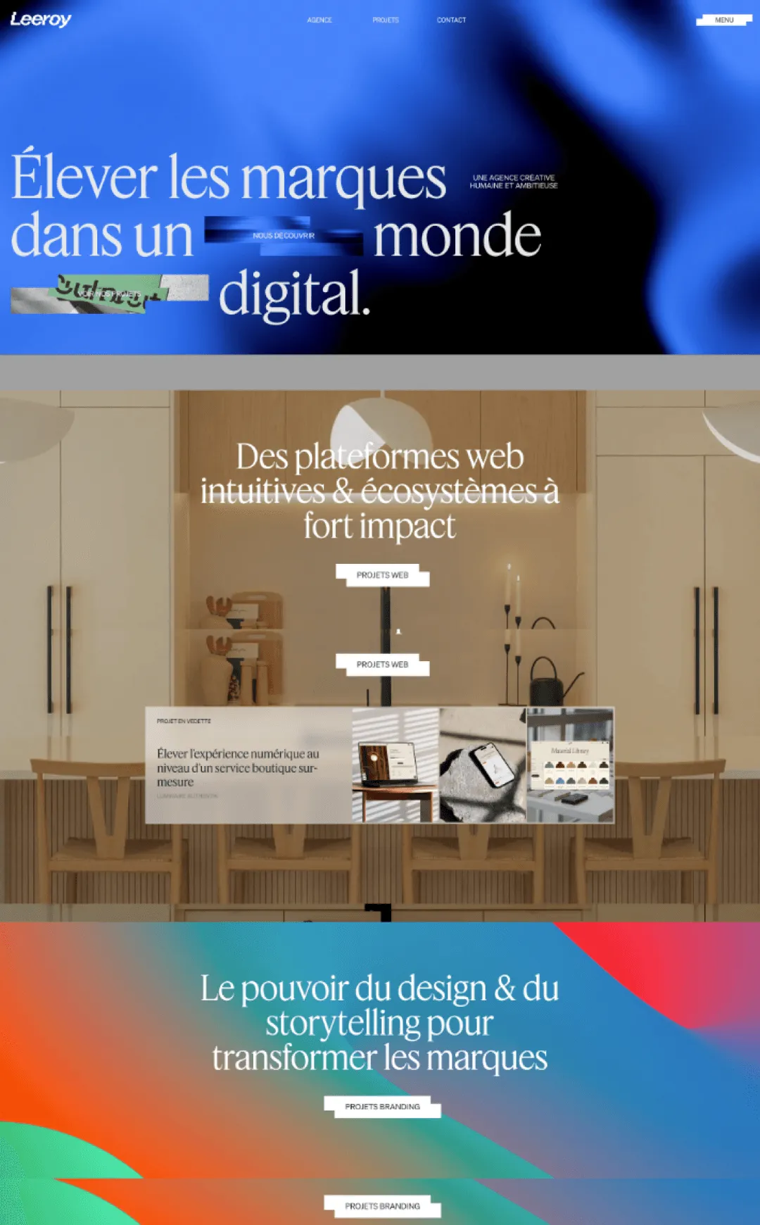
CONDENSED
Minimal spacing, a high density of content.
Elements are placed close together, making the most of available space and reducing the need to scroll.
Technology companies, e-commerce and content-heavy websites - where speed, efficiency and quick access to information matter.
Intensity. Functionality. Focus.
Efficiency. Everything within reach.
see examples online
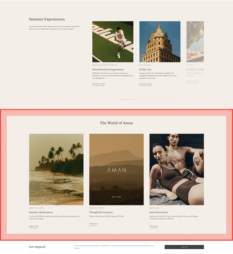
SPACIOUS
Generous spacing between elements creates a sense of openness. The layout feels lighter, giving users space to focus and process content comfortably.
Premium brands, creative studios, wellness and design-driven businesses -where aesthetics and experience matter.
Elegance. Clarity. Calm.
Lightness. Sophistication.
SEE REAL EXAMPLES online
COMPARE layouts
CONDENSED

SPACIOUS

TYPOGRAPHY
It can feel formal and authoritative - or light and expressive.
In this section, we’ll define which typographic style best fits your brand -
classic, modern, or a combination of both.
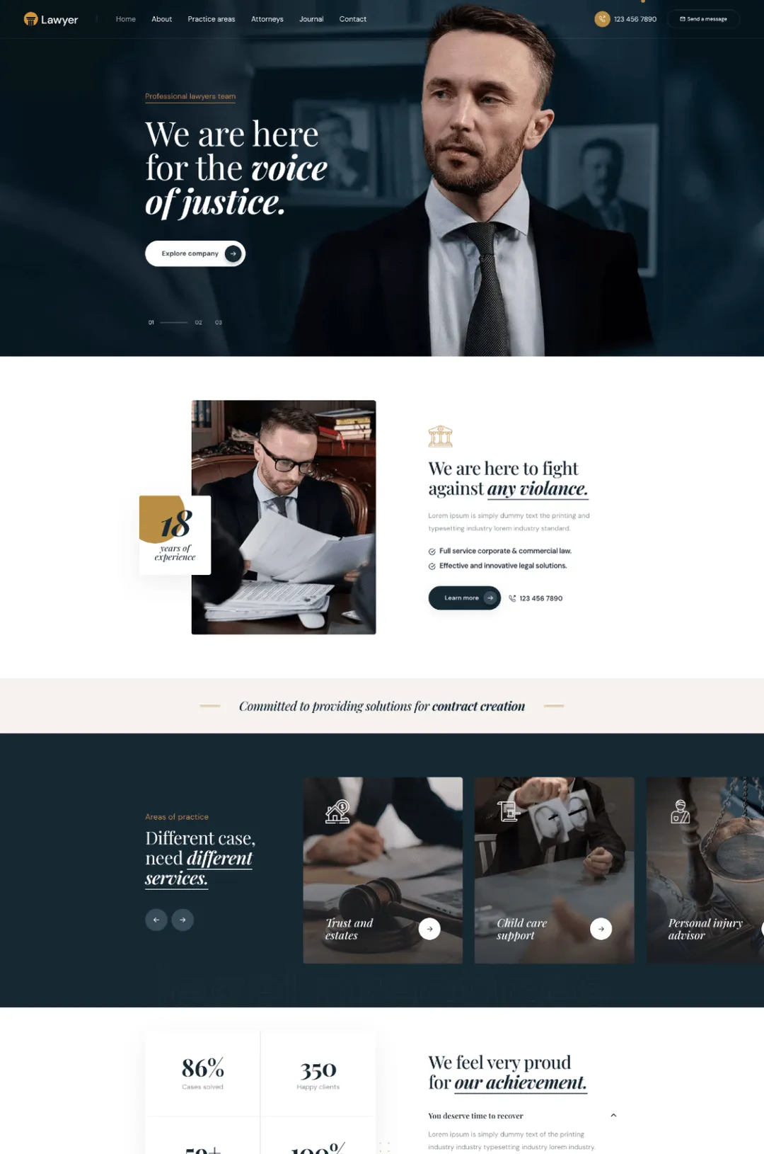
SERIF
Fonts with decorative strokes, associated with tradition and print.
They feel classic, elegant and trustworthy.
Law firms, cultural institutions and premium brands - especially those that emphasize tradition, credibility and experience.
Class. Authority. Tradition. Trust.
Best used in headlines or short text blocks rather than long passages.
see examples online

SANS-SERIF
Clean, simple and highly legible.
The most commonly used typefaces in digital environments.
Startups, technology companies, e-commerce and modern brands - where clarity, speed and accessibility matter.
Modernity. Simplicity. Freshness.
Clarity and ease of use across all devices.
SEE REAL EXAMPLES online
MIX
A combination of serif and sans-serif fonts - typically serif for headlines and sans-serif for body text.
Creative, cultural and educational brands, those that want character while maintaining readability.
Balance. Contrast. Style.
A refined look with a modern edge, when used thoughtfully.
SEE HOW IT WORKS IN PRACTICE
FOR WEBSITE DESIGN


